women picking out colors for office

Choosing a paint color for an office can be a challenge. Whether it’s a home office or commercial office, an office should promote productivity and feel comfortable at the same time. You may also need to consider employees and clients when choosing office paint colors for your business.

Although it can be easy to paint the walls white and call it a day, you deserve to have paint colors that uplift you and help you focus. While white might be the best office color for some, it can feel uninspiring to others. There are many gorgeous paint colors to choose from — you need to find the one that works best for you. We’re here to help you get started.

In this post, we’ll explore the power of color and how it impacts mood and productivity. We’ll also look at the best office colors for different industries and provide tips for choosing a color that will make your office feel inviting and inspiring.

Does Color Really Matter?

best color to paint an office for an architiect

Color can affect our moods and productivity. This is because color influences our behavior and thought processes through learned associations. For example, someone might love the color red because they associate red with cherry pie and their favorite toy from childhood. Red might make this person feel joyous because it reminds them of positive memories.

Color associations can affect how we perform specific tasks. In a study conducted by the University of British Columbia, red increased participants’ performance on detail-centered tasks such as memory retrieval and proofreading by up to 31% compared to blue. However, participants produced twice as much creative output when prompted with blue cues, suggesting that blue is best for creative tasks, like brainstorming.

Researchers believe that blue enhances creative performance because we associate blue with the sky and ocean’s tranquility and openness. This helps us feel safe exploring and expressing creativity.

On the other hand, red is associated with stop signs, fire trucks, and objects we typically associate with danger, mistakes, and caution. Red heightens our motivation to act with careful attention so that we avoid risk and mistakes.


Choosing Saturation and Brightness

Our emotional response to color also depends on color saturation and brightness. Saturation refers to the purity of a color. For example, less saturated colors are more grayish than high saturated colors. So, a gray-blue is less saturated than pure blue, for example.  Less saturated colors and bright tend to be relaxing, while dark saturated colors usually have a more energizing effect.

Although the perception of color is subjective and influenced by cultural factors and personal experiences, some colors tend to have universal meanings and evoke either positive or negative reactions. For example, a study published in Psychonomic Bulletin and Review discusses how adults commonly prefer blues and dislike greenish yellows. People may associate greenish yellows with things they dislike, such as dirty water or rotten food. Most adults associate saturated blue with something they like, such as the sky and water.

So, does color really matter? You might think of color as a strong communication tool that you can use to influence behavior and mood. Color can affect how people perceive you and your business. Most importantly, your office’s color can play a major role in how you feel while you work. For these reasons, we feel it’s safe to say that yes, color does matter.

What Is the Best Office Paint Color for My Industry?

Dark color walls as shown here can be a best color to paint an office for a dramatic effect

When choosing the best wall colors for your office space, it’s essential to consider your industry. While black walls may look glamorous in a fashion designer’s office, for example, they likely wouldn’t suit a doctor’s office so well. You need office paint colors that will complement your industry. That way, your office will promote productivity, whether you need to draw up designs or analyze data.

Since people associate colors with particular meanings, you’ll also want to consider how your office colors might affect your employees and clients. To help you choose the best paint color for your professional office, we’ll explore some of the top industries in the mid-Atlantic region and the colors that promote efficiency for each industry. Whether you own a technology business in Washington D.C. or a law firm in Baltimore, there’s a paint color that will motivate you and help you stay calm. Here are some office paint color ideas to help you get started.

Law Office Paint Color Suggestions

Lawyers spend a lot of their time in their office advising clients, conducting research, and preparing for court cases. A lawyer’s job usually entails long work hours and high stress. Lawyers can benefit from painting their office a color that helps relieve stress and promotes focus and productivity.

Lawyers also need to consider the message they want to send to clients through the power of color. Clients want to work with lawyers who convey authority, knowledge, trustworthiness, and confidence. Clients also want to feel comfortable and secure when they meet with their lawyers. Therefore, lawyers need a calming color that also portrays professionalism.

Best Paint Colors For Law Offices

    • Blue: Blue is one of the top offices to paint colors for lawyers. It suggests stability, trust, efficiency, intelligence, and duty, everything a client wants. Choosing a lower saturation blue, such as a blue-gray, will help create a soothing effect. A sophisticated navy blue or teal are also an attractive option. Blue’s calming effect helps boost efficiency and focus.
    • Green: Green is also a soothing color that increases focus, efficiency, and an overall sense of well-being. It is the color associated with nature and maybe an excellent office color choice for an environmental law firm. The human eye sees the color green better than any other color, which means it’s less straining on the eyes — perfect for working long hours.
    • Brown: Brown is associated with support, reliability, and seriousness and lends a natural feel to an office. Brown also creates a warm, professional look. Lawyers might choose a light shade of brown to make clients feel welcome and secure. A darker shade of brown can work as a powerful accent wall.

Designer Paint Color Suggestions

Designers may own a firm or studio or work in a commercial office. Designers such as graphic designers, interior designers, or any other creative field professionals need a space that promotes productivity and creativity. They also need to consider how they can project an image of expertise to clients. When a client steps into a designer’s office, they should feel assured that the designer is inspired, skilled, and perfect for the project.

Yellow cab be the best color to paoint an office for inspiration and energy

Specific colors are associated with increased creativity and innovation. We already mentioned that blue is an excellent choice for promoting creativity, but that’s not the only option. Other colors have the potential to evoke a cheerful mood and spark creativity. Designers, writers, artists, innovators, and anyone who needs creative brainpower should consider applying the following paint colors to their office space:

How Should Designer Consider Colors?

    • Yellow: Yellow is a stimulating color associated with optimism, confidence, innovation, and creativity. It’s the strongest color psychologically. Designers can use yellow to boost self-esteem and add cheerfulness to an office space. Because yellow is an intense attention-grabbing color, it usually works best in large office spaces or an accent wall. A yellow accent wall is a great way to add a burst of energy to an otherwise white office.
    • Purple: Purple has long been the color associated with wealth and royalty and, therefore, conveys quality and luxury. Designers might choose a gray-violet color for their office because this color is often associated with sophistication. For example, an interior designer may wish to impress clients with an image of luxury and sophistication.
    • Orange: Orange, which combines yellow and red, is a passionate, fun color that encourages playfulness and creativity. A splash of orange can come in handy when designers need to play with ideas and develop creative solutions. However, too much orange can create a mood that lacks seriousness, so it’s best to use orange for an accent wall.
    • Black: Black communicates sophistication, glamour, and efficiency. Black can be part of a striking office paint color scheme if it’s balanced with other colors. For example, black walls with white furniture or accessories can make a powerful impact on clients.
    • Green: According to a study published in 2012, when participants glimpsed at green before undertaking creative tasks, it enhanced their creative performance. Green signifies growth. This may act as a cue to increase motivation for growth, leading to an improvement in creativity. Designers will find plenty of satisfying options when it comes to green paint colors.
    •  

Manufacturing Paint Color Suggestions

The manufacturing environment is typically noisy, with the sound of machinery running all day. Despite this, office clerks need to concentrate on tasks and focus on details as they answer phones or enter data. Manufacturing managers need to solve problems, make decisions, motivate the workforce, and work under pressure. Overall, a manufacturing environment is about productivity, teamwork, and efficiency. It might seem difficult to manage stress in a bustling manufacturing facility, but with the help of color, nothing’s impossible. Here are paint color ideas for an office at a manufacturing facility:

How Should Manufacturers Consider Paint Colors?

    • Blue: Blue is the most popular color for both men and women. In a large manufacturing office, blue is an excellent choice because it will appeal to many people. Blue promotes productivity because it creates a calming environment that helps workers stay focused. Office managers might paint a calming shade of blue and add stimulating accent colors like red to boost attention to detail without overwhelming the senses.
    • Green: Green walls can help employees and managers stay focused for long periods and reduce stress as they work under tight deadlines. Green can also bring a sense of nature into the office, which may be especially helpful if the facility does not have many windows.
    • Red: Manufacturing managers do a lot of walking throughout the day as they check on operations. They need the energy to keep up with the physical demands of the job. Red can provide a boost to help managers maintain energy levels. It has been proven to enhance physical speed and strength. Red can also be overstimulating if used excessively, so it’s important to balance it with soothing shades or use it only as an accent wall.


Technology Office Paint Color Suggestions


Green can be a best color to paint an office if you are a liberal

Those who work in the technology industry, such as software developers and information technology (IT) technicians, spend a lot of time at their desks. Whether they are solving technical issues or writing code, a big part of the job is managing time well. Tech professionals need to finish projects on time while using a vast range of analytical skills, problem-solving skills, and communication skills. In other words, technology workers have a lot of thinking to do, so they need an office space that promotes productivity, focus, and a sense of calm.

Best Painting Colors for Technology and Why

Blues and greens are the best paint colors for technology professionals because they support intellectual tasks and create a sense of peace. Blue or green can help a tech stay calm and focused while helping a client solve a complex issue. Green also reduces eye fatigue. A green wall can provide a place to rest the eyes throughout the day.

A high saturation green accent wall may be the perfect paint color to promote innovation and creative problem-solving. Teal combines the best of both blue and green and can create an atmosphere of high productivity. Add bursts of energizing colors such as red, yellow, or orange in artwork or accessories to keep motivation levels high.

 Healthcare Paint Color Suggestions

Healthcare professionals who own private practices need to create a calming, clean, and comforting environment. Every day they may see patients who are scared, stressed, or in pain. Employees may also experience high levels of stress. Healthcare professionals should choose soothing paint colors. They should avoid intense high saturation colors like pure red or orange. Colors with low saturation can feel soft, which can be comforting to patients and staff. It’s also a good idea to keep colors light because light colors are associated with cleanliness and airiness.

How Should Technology Choose Paint Colors?

  • Light blue: Light blue creates an open, airy feeling and can make a healthcare office feel less stuffy and cleaner. Like the sky, pale blue also serves as a lovely backdrop for plants, creating an office feel more natural and less clinical.
  • Off-white: White evokes cleanness and hygiene and makes space appear larger. However, pure white may feel too sterile and intense, so it’s best to choose an off-white shade to create a more welcoming environment.
  • Green: Green is a healing color. For example, according to a well-known study, patients recover from surgery faster when they have a window facing trees rather than a brick wall. Painting a healthcare office green can have a positive effect on everyone in the office. Even dark green can have a soothing effect.
  • Light pink: Pink is nurturing, feminine, and warm. Pink may be the ideal color for a women’s health office or a child’s healthcare office. Even though pink contains red, it can have a calming effect if it’s kept light.

Financial Services Paint Color Suggestions

Dark office color on wall can be a best color


Those who offer financial services, such as accountants or financial advisors, have a lot of responsibility. They must be accurate, meet deadlines and stay organized, all while providing exceptional customer service. Clients must feel like they can completely trust their financial advisors with their assets. If they have any doubt in their mind about trust, they’ll look elsewhere for assistance.

Those who work in the financial industry must communicate professionalism, reliability, trust, and expertise. They also need a space to focus, analyze, research, share, and meet deadlines. They’ll want to avoid any colors that are distracting or come off as playful. Here are some recommended colors to paint an office for financial professionals:


Best Financial colors

  • Green: Green is the color of money, making it an excellent choice for a business’s financial services. It’s also associated with good luck and growth. Clients want to feel assured that their assets are in good hands and that their wealth will grow. Green paint colors can help them feel secure in their decision to seek financial assistance. Dark green walls with rich wood accents can make everyone in the room feel more at ease.
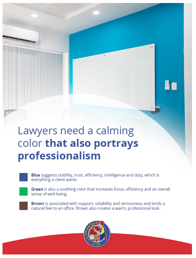
  • Blue: Clients must feel a sense of trust, security, and reliability when entering a financial professional’s office. Blue-gray paint color can evoke calmness and confidence while also creating a professional look.
  • Black: Black depicts seriousness like no other color. Black office walls also communicate confidence and power. Clients want to know that their money is not being played with, so black may be the perfect paint color to make clients feel secure.


Construction Paint Color Suggestions

General contractors do everything from project planning to communicating with clients and architects. They need the energy to manage a wide range of tasks, and they want to make clients feel secure. Contractors should consider painting their office a shade of brown to communicate strength, dependability, and warmth. The color brown can help clients feel comfortable discussing projects, creating a sense of stability.

Contractors should consider adding bold accent walls alongside neutral colors to energize the space. Splashes of red, orange, or yellow can keep energy levels up and help contractors stay productive when physical activity is needed.

Lastly, contractors might paint their office a rich blue color to communicate trust and reliability or green to convey a focus on sustainability. Blue and green will also help contractors concentrate and stay calm.

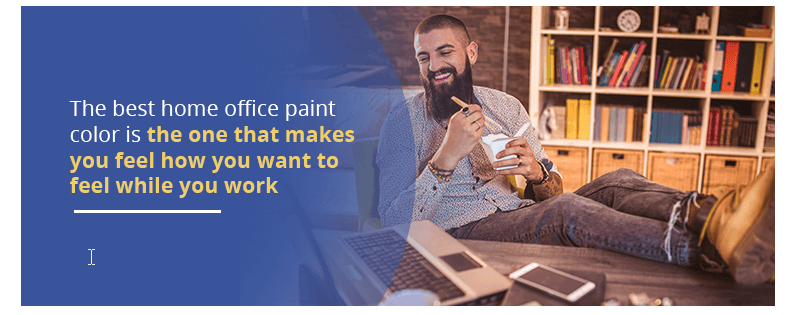
What Color Should I Paint My Office at Home?

Best paint colors in office for webinars

You have a lot more freedom when choosing a paint color for your home office than a commercial office. Your home office can feel serious and sophisticated or bright and playful — it’s all up to you. If you are the only person spending time in your office, you can choose a color that suits your unique needs and personality.

The first step to choosing a paint color for your home office is to ask yourself what you hope to accomplish in the space. Do you need a color that calms and soothes you? Or do you want a color that stimulates you? Consider what you need more of in your workday and how color can help you. Choose high saturation if you want stimulation and low saturation if you want peacefulness.

Next, think about the colors you love and how they make you feel. For example, does yellow energize you and bring you joy, or does it irritate you?

“You’ll be spending a considerable amount of time in your office working, so you want to choose a color that motivates you without increasing your stress levels.” –

Designer Mark Coale of Maryland Paint

Need some ideas?

If you’re not sure which colors you love, look for inspiration. Inspiration is all around you in photos, magazines, online resources, and your favorites objects around the house.

You can try to apply a soothing hue like blue or green and incorporate accent colors that support your job. For example, if you work in sales, red would make an excellent accent color. If you need to focus for long periods, consider painting your office blue and adding yellow accents to inspire optimism and confidence. The key is to make sure you balance your office paint color scheme because too much of the same color can make a room feel uninteresting.

What colors look best for webinars?

Perhaps the most interesting aspect of a webinar meeting can see what the other person’s office looks like.  Having dull off-white paint on the walls and a garage sale picture in the background shows poorly.  Mid-tone earth colors can also have a drab, depressing feel.  Clean contrasting colors where there are sharp differences look good on camera. Pure blues and white look great. Just stay away from muddy colors.

There’s no right or wrong answer as everyone has their own experiences with color. The best home office paint color is the one that makes you feel how you want to feel while you work.


Bright Green office hallway


The color theory goes all the way back to Aristotle in Ancient Greece. Though thousands of years have passed since then, there is still much to learn about color and its effects. For now, it’s generally understood that color impacts the viewer through the power of association.


How Do You Feel About These Colors?


        • Red: The color red appears closer than it really is. This strong, stimulating color can have a physical effect and raise blood pressure. Red is associated with courage, strength, energy, boldness, confidence, activity, love, excitement, and attraction. Red may also be associated with aggression.
        • Blue: Blue has more of a mental effect than a physical one. It is associated with intelligence, trust, logic, calmness, safety, trustworthiness, and communication. Intense dark blue stimulates thought, while light blues promotes concentration and tranquility.
        • Brown: Brown is an earthy color associated with nature, reliability, support, and seriousness.
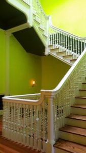
        • Green: Green is a restful color because it is easy on the eyes. It is associated with balance, rest, peace, harmony, creativity, and environmental awareness. Green is reassuring because it’s the color of healthy growing trees and plants.
        • Yellow: Yellow is an emotionally stimulating, attention-grabbing color. It is associated with extraversion, friendliness, energy, happiness, confidence, optimism, and creativity. Yellow stimulates the appetite and has the power to boost self-esteem. Too much yellow can be overwhelming.
        • Orange: Orange is a warm, stimulating color that has both physical and emotional effects. Like yellow, orange stimulates the appetite. Orange is associated with enthusiasm, fun, playfulness, and passion.
        • Purple: Purple promotes introversion and contemplation. It is associated with luxury, quality, wisdom, authenticity, and the mystery of the cosmos.
Pink room

How about White and Black?

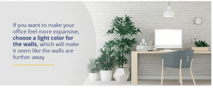
  • White: White is not considered a color because it is not present in the visible spectrum. Instead, white is what we see when all the wavelengths of light reflect off an object. White is associated with freshness, cleanliness, purity, innocence, modernity, sophistication, and efficiency.  A room will look its largest when painted white.
  • Black: Like white, black also is not considered an actual color in the spectrum. Unless black paint has a high sheen, it will absorb light and make a room look smaller. Black is associated with security, sophistication, power, glamour, efficiency, and excellence.

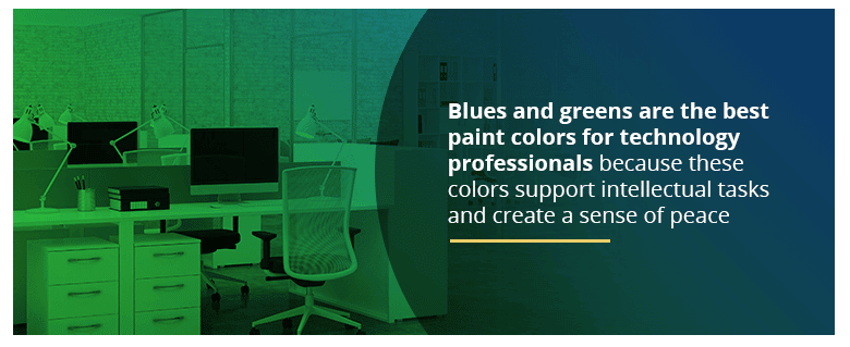
What Is the Best Color for Focus?

The best color for focus depends on the task. According to the University of British Columbia study, which looked at colors, red is the best color for focusing on detail-oriented tasks, while blue enhances creative performance.

What Is the Most Relaxing Color?

Blue colors tend to be considered the most relaxing. For example, one study found navy blue to be the most restful color, while another established cobalt blue as the most relaxing color. In general, colors found abundantly in nature, like blue and green, tend to have soothing effects.

What Is the Most Calming Color for an Office?

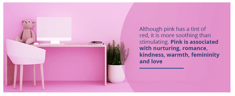
As mentioned above, blues, greens, and blue-greens like teal are usually the most calming colors for any space, including offices, because they reflect the colors of the sky, trees, and grass. However, other colors can also have a calming effect. For example, light neutral colors are also generally soothing, and soft pinks are inviting and comforting. Whether or not a color is calming mostly depends on personal preference.

great office colors painted by Klappenberger & Son


Is Gray a Good Color for an Office?

Gray is a neutral color, so it does not have any direct effects psychologically.

If you love the color gray, you can still use it in your office by countering it with bright colors. For example, gray can create an inspiring modern feel when placed next to a bold yellow accent wall. You can also use furnishings and accents to add splashes of color to make a gray office more uplifting.

What Colors Stimulate the Brain?

conference room in Baltimore

According to a University of Texas review, it seems that dark colors like red, blue, green, and purple stimulate the brain to enhance task performance. Study participants who completed tasks in offices painted white, beige, yellow, and gray made more mistakes than those who worked in darker offices.

According to color psychologist Angela Wright, blue stimulates the mind, while red has physical effects, and yellow has emotional consequences.

Factors to Consider when Choosing an Office Color?

light color office wall


Choosing a paint color can be an exciting exercise, mostly once you’ve learned about the effects of color. It can still be challenging to choose a paint color when there are so many options available and so many factors to consider. Here are some tips to help you through the process:

Think about the colors you love:

Look at clothing, artwork, and fabrics you own and notice colors that attract you. Consider how these colors make you feel. This is always a good starting place for choosing a paint color. However, keep in mind that you may love color in small doses but may feel overwhelmed by it if it surrounds you. You might choose a lighter shade of an intense color that you like.

Consider the rest of your home or business: 

If you’re looking to paint your home office, consider how you can unite your office’s colors with the rest of your home for a cohesive look. This doesn’t mean you have to use the same color scheme in your office but aim to complement other colors when viewed from another room.

Consider large pieces in the room: 

Whether you’ll be painting the office at home or your business, make sure to consider large features like woodwork, fireplaces, flooring colors, and other surfaces. Choose paint colors that complement other elements in the room.

Consider purpose:

Do you want to draw people into your office? If so, red or orange walls draw attention because they are warmer colors.  Also, think about who will be entering your office. Will you be the only person using the office, or will clients be meeting you there? If clients are coming to your office, choose paint colors keeping your industry in mind.


Consider The Temperature, Size, And Amount Of Light

Consider temperature:

It may seem strange to think about temperature when choosing a paint color, but it makes a difference in comfort levels. If you like to keep your office cool or get a lot of direct sunlight, consider choosing blue or green paint colors. If your office often feels uncomfortably cold, paint the walls a warm color like a comforting peach. Warm colors can actually make you feel like you’re in a warmer space.

Consider size:

Is your office small or large enough to live in? If you want to make your office feel more expansive, choose a light color for the walls, which will make it seem like the walls are further away. If you’d like to make your office feel smaller and cozier, choose dark wall colors to pull the walls in visually.

Consider light:

Consider how much light you get in the room, as this will affect the paint color’s appearance. For example, light can make gray appear lavender. Before painting the entire wall, apply a small patch of paint or tape a color sample to the wall to see how it looks in natural and artificial light.

Professional Painters Can Help

man painting office

                                                                     If you need reliable painters in MD, DC, VA, and FL, please contact us.

It’s estimated that humans can see up to ten million colors — that’s a lot of potential paint colors to choose from. If you’re still wondering how to select the best color for your home office or need commercial office paint color ideas, Klappenberger & Son is here to help. Since 1989, we have been a leader in exterior and interior paint services. If you need reliable painters or carpenters in the areas listed below, then contact us today.

  • Maryland
  • Virginia
  • Washington D.C.
  • Miami
  • Fort Lauder Dale
  • Northern VA